Information architects need to slow down!
Spoken at the legendary ASIS Summit 2000, these words of caution surrounding time and responsibility were perhaps directed towards myself as much as my audience.
In those heady days before the bubble burst, the velocity of growth and change had become frightening. We skimmed the surface, creating designs, forming strategies, making decisions with no time for reflection. A crash seemed at once inevitable yet unimaginable.
Fast-forward to the present, and life has slowed down for many of us. While the experience has been far from frictionless, there is a silver lining. We have been granted the gift of time.
Time to spend with our families. Time to read, relax, and generally recreate. And of course, most importantly, time to reflect deeply about the speed of information architecture.
The Infinite Loop of Destructive Creation
What bothers me most about web and intranet redesign projects is the widespread practice of throwing out the baby with the bathwater.
The site development process moves from strategy to design to implementation. Then, after a period of maintenance often measured in months not years, someone decides a redesign is required.
Perhaps there’s a new CEO who wants a “fresh look” or the IT department purchases a Content Management System. Maybe the User Experience team just gets bored with maintenance.

Whatever the justification, someone commits to a take-no-prisoners redesign that obliterates all elements of the prior site. In the worst cases, an entirely new team is assigned to “do the job right this time,” assuring no organizational learning whatsoever.
I’m optimistic we can break out of this infinite loop, changing focus from project to program, but first we must better understand and disentangle the currently interwoven layers of information architecture, content and interface.
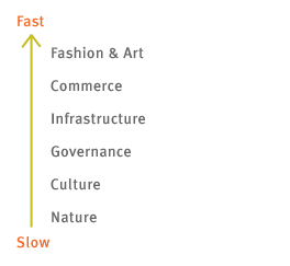
Fast and Slow Layers
In The Clock of the Long Now, Stewart Brand introduced the notion that society is a construct of several layers, each with a unique and suitable rate of change.

The slow layers provide stability. The fast layers drive innovation. The independence of speed between layers is a natural and healthy result of societal evolution.
Imagine the alternative. How about commerce moving at the pace of Federal bureaucracy? Remember the Soviet Union? Enough said.
This recognition of independently dynamic layers holds great promise within the narrower domain of information architecture.
By isolating enduring IA from adaptive IA, we can invest sensibly in long-term infrastructure while creating flexibility where it’s needed. Sounds easy, right? So what’s been stopping us?
I Blame Yahoo!
Yahoo is one of the great success stories of the Web. And we librarians have been eager to proudly note it was built through manual classification using a taxonomy designed by humans. A high-profile exemplar that software can’t do it all.
And yet, Yahoo’s success is a root cause of the infinite loop of creative destruction. Portal vendors and managers have become devout worshippers in Yahoo’s Church of the Taxonomy.
Builders of web sites and intranets have been seduced by the dream of a single enterprise Taxonomy that provides quick, intuitive access to all content and services.
It’s scary how pervasive the Taxonomy (with a capital “T”) has become. I know some corporate librarians who literally cringe when they hear the word.
So What’s Wrong With Taxonomies
Size
Following in the footsteps of the Dewey Decimal System, Yahoo took a highly pre-coordinate approach, attempting to create controlled vocabulary terms (i.e., names of categories) for every imaginable subject. The result? An informal count suggests more than 67,000 categories in Yahoo with roughly 4 to 8 levels of hierarchy between the main page and actual content. That’s a lot of vocabulary to manage. Portals that take this approach wind up growing an enormous category structure that constrains their ability to adapt.
Simplicity
The siren song of simplicity suggests you can create one organization scheme to serve all audiences, tasks and information needs. Even better, with the Taxonomy model, your classification scheme is your user interface. What you see is what you get. It is this inherent simplicity that creates a problem. The Taxonomy model joins information architecture, content and user interface, making it difficult conceptually and practically to recognize and leverage separate layers with unique rates of change.
The Future is Faceted
Faceted classification serves up multiple “pure” classification schemes rather than a single “motley” Taxonomy.
Because each facet is focused on a specific, limited dimension of the information space, its hierarchy can be much smaller and flatter. Even with several facet hierarchies, you’re dealing with relatively few controlled vocabulary terms. However, through the power of post-coordination, you’re able to create a huge number of combinations.
Consider the following (rough) numbers for wine.com
| Facet | # of Vocabulary Terms |
| Type | 46 |
| Region | 16 |
| Winery | 750 |
| Price | 6 |
| Ratings | 6 |
| Total Terms | 824 |
| Total Combinations | 19,872,000 |
With only 824 controlled vocabulary terms, users of wine.com can define almost 20 million discrete facet combinations. They can ask for a Merlot (Type) from France (Region) under $20 (Price) or a Top Rated wine (Ratings) from Cakebread Cellars (Winery).
And users can seek what they want using integrated searching and browsing interfaces that are both powerful and flexible.
You see, with this post-coordinate approach, the classification scheme is not the user interface.
Nowhere on the site does wine.com force users to interact with the full set of unadulterated facet hierarchies. Instead, wine.com’s interaction designers have made careful decisions about how to expose users to facets.
Only 3 facets are featured on the main shopping page.

The other facets provide support on the results page as options for a user-defined sort order. And finally, all facets are accessible from the search interface.
The key here is the separation of classification scheme and user interface. The user interface can be modified quite significantly over time to address usability problems or changing business goals, without touching the underlying classification schemes.
Information Architecture Layers
This brings me back to the quest for a layered model that helps us understand and leverage the unique qualities of various information architecture components.
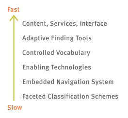
Consider the following figure an early (and probably flawed) attempt to identify these layers.

Lowest and slowest are facets and their hierarchies. These constitute the foundation of the enterprise IA infrastructure.
Next, the embedded navigation system composed of browsable taxonomies, indexes, and the search system defines at a fundamental level how users are able to search and browse.
These two bottom layers should be stable. They become intertwined with content, technology and process. They become core to users’ mental models. Change at the bottom is painful and expensive.
You also don’t want to frequently switch enabling technologies such as content management systems, search engines, and portal software because they too become enmeshed with content and process.
Moving to the faster layers, controlled vocabulary terms will evolve with product and service offerings and with the broader language of business and technology. Adaptive finding tools such as project-specific guides, indexes, and collaborative filtering devices may benefit from continuous adaptation. And, finally, the site’s content and services may change on a regular basis, along with tweaks to the user interface.
The Long Now of Information Architecture
Perhaps slowest moving of all is our communal understanding of how to practice information architecture effectively.
It’s so easy to move fast and learn little.
As we slow down, hopefully we can leverage the concepts of facets and layers to break the infinite loop of destructive creation, designing information architectures that are both enduring and adaptive at the same time.
by Peter Morville