I had the honor and privilege of giving the STC Summit opening keynote in Denver, Colorado, and receiving the award of STC Honorary Fellow. Slides are here. This is an edited transcript.
Hello! I’m so happy to be here with you to talk about information architecture and the organization of time, but first I want to tell you the story of this place. Harpers Ferry is situated at the confluence of the Potomac and Shenandoah rivers where Maryland, Virginia, and West Virginia meet. It’s the psychological midpoint of the Appalachian Trail. And it’s best known for John Brown’s raid on the Armory in 1859.
After working with the Underground Railroad for years, John grew convinced that to end slavery, violence was necessary. The Armory was the first step in his plan to free and arm slaves, and engage in guerilla warfare. But he was undone by bad luck. Harriet Tubman helped to organize the raid but fell sick and couldn’t participate. And one of his own men let him down by not delivering a wagon of arms at a critical juncture. John was captured by Robert E. Lee, tried for treason, and hanged.
While awaiting execution, John was surprisingly cheerful, noting “I cannot now better serve the cause I love so much than to die for it; and in my death I may do more than in my life.” And he was right. Twenty years later, Frederick Douglas said “if John Brown did not end the war that ended slavery, he did, at least, begin the war that ended slavery.” Now, you may be wondering what John Brown and Harpers Ferry have to do with information architecture, and I will try to connect the dots, but to do so, first, I need to tell you the story of my life. Don’t worry. It’s the short version.
In the early 1990s, I went to library school at the University of Michigan, where I fell in love with the Internet. And I had a dream. I wanted to organize information so people could find what they need. And that’s precisely what I’ve done. Over the years, I’ve helped all sorts of organizations with their information architecture and user experience challenges.
Along the way, I’ve written a number of animal books about information architecture, findability, search, systems thinking, and planning.
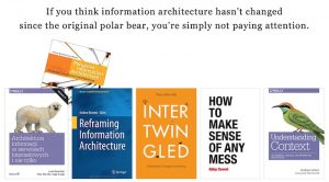
As an aside, I’d like to tell you a story about the polar bear book. Starting in 1994, Lou Rosenfeld and I built an IA consultancy called Argus Associates. By 1998, we’d grown to roughly a dozen people. One of the smartest and most difficult of those people was an information architect named Steve. He delighted in challenging our authority. So, to set the stage, Lou and I have been working hard to write a book while running a company, and in 1998 the polar bear book is published. A few weeks later, Steve offers to give a book review at a brown bag lunch. So, we’re all gathered around, and Steve lifts up a copy of Dynamics in Document Design by Karen Schriver and says “this is the best book I’ve ever read on information architecture.” I tell this story, first to thank Karen, an STC fellow and community leader, for writing a great book about information architecture; and second, to acknowledge that the practice of information architecture has been informed by the field of technical communication from the very beginning.
Looking back, of all the books I’ve written, it was the polar bear that made the biggest splash. It helped to define the discipline of information architecture, and to this day shapes how we practice user experience. And that’s a good thing, because what we might now call “classic information architecture” is more difficult and more important than ever. That said, all maps are traps, and I believe we need to go beyond the polar bear. To explain, let me tell you about my work with the Library of Congress.
In 2009, I was invited to evaluate the Library’s web presence. I conducted stakeholder interviews and user research, and I began to assess the Library’s websites, which was harder than you might expect, because it turned out the Library had over 100 websites, all with different identities and navigation systems. So, in my report, I was brutally honest. I compared the Library’s web presence to the Winchester Mystery House.
The Winchester Mystery House is a well known California mansion that was under construction, continuously, for 38 years. As the legend goes, the wealthy widow who lived there had been told by a psychic that when the building was done, she would die. So she just kept adding hallways and staircases and rooms. If you ever visit San José, you should take the tour, but beware; while the view from any one room isn’t unusual, the house is a findability nightmare. If the tour guide leaves you behind, you’re never getting out.
So, I flew to Washington, D.C. to present my findings to all the major units of the Library, but upon arrival I was told my meetings had been canceled and my report placed under an embargo. I did meet with the chief information officer, and she said “Peter, we agree with you, we must fix this mess, but your report will upset too many people, we can’t let it out.” So, I flew back to Ann Arbor, and continued to work with the Library on small projects, but I was frustrated. I wanted to help.
Fortunately, over the next few months, my report percolated through the black market channels of the Library of Congress, eventually making its way to the Executive Committee, and at the highest level they decided: “We must change how we work on the Web. And let’s ask that guy who identified the problems to help us with solutions.”
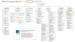
So I worked with the Library on web strategy and information architecture for the next two years. We made real progress, and I’m proud of our work. But we didn’t get nearly as far as I’d hoped. To explain why, it helps to look through the lens of the org chart.
I was brought in by a middle manager, and from that vantage, we could see the problem, but we couldn’t solve it. We lacked authority. Later, when the Executive Committee formed a Web Governance Board with representatives from the major units, and chaired by the Chief of Staff, we had the authority and were able to advance. So what held us back? Well, look at all those little boxes. Our work was subject to pushback, because while we tackled governance, we failed to address culture.
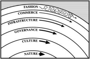
At the first IA Summit in Y2K, I shared this pace layer model and Stewart Brand’s insight that “the fast parts get all the attention, but the slow parts have all the power,” and it’s been celebrated within the community ever since. I suspect we are drawn to information architecture in the same way John Brown was drawn to Harpers Ferry. IA isn’t big and doesn’t hold much territory, but it is an important crossroads, a place of bridges and borders where a small force can make a big impact, especially if we have the courage to go beyond infrastructure to wrangle with governance and culture.
That said, we shouldn’t get carried away with change. Mostly we should design for fit. As Frank Lloyd Wright advised “no house should ever be on a hill or on anything. It should be of the hill. Belonging to it.” We should aim for “organic simplicity,” the synthesis of form and function that’s embodied in a wildflower in a field.
I have a Frank Lloyd Wright story of my own. A few years back, while visiting my wife’s parents in Rockford, Illinois, we enjoyed a wonderful tour of the Laurent House. Because my father-in-law has difficulty walking, we requested a wheelchair. This worked out well, since this beautiful Usonian is the only home that Frank Lloyd Wright designed for a person with a disability. From carport to patio, it’s all level, no steps. Halls and doorways are wide. Light switches are reachable. The ceiling is low, as are the seats, so the person in the wheelchair is the tallest in the room.
Kenneth Laurent was not a wealthy man. When he first wrote to Frank Lloyd Wright in 1948, he was a 29 year-old disabled veteran, living in hospital, in need of a home in which he could function. The architect responded with this “little gem” that made Ken feel like a king in his castle. He and his wife Phyllis lived there for the next 60 years. Looking back, Ken noted “Every day I would come out of my bedroom and stop outside the door. Looking down the hallway and the 60 foot long wall, it made me forget about my disability and focus on my capability.”
The Laurent House is an exercise in organic simplicity, design for difference, and inspiration architecture. It’s a tiny home that makes a big impact. If you get the chance, visit. Be sure to peer through the horizontal windows in the bedroom. Standing, you see the busy road, but take a seat, and you see the world from Ken’s perspective: nothing but green trees and blue sky.
Of course, as information architects, we’re mostly not in the business of building houses. As my friend Jorge Arango says “where architects use forms and spaces to design environments for inhabitation, information architects use nodes and links to create environments for understanding.”
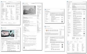
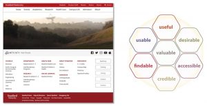
This website, for instance, is organized by audience, topic, task, school, and department; and offers Search, a Directory, and an A-Z Index. It’s an illustration of the principle that we must provide multiple paths to the same information to enable findability, and to support diverse users and tasks.
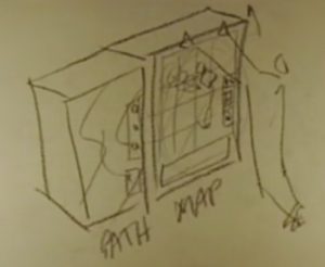
But as Bill Verplank reminds us, while paths are necessary, they’re not always sufficient. A path, like an opaque Coke machine, is easy to use and efficient, but if something goes wrong, you’re lost. In contrast, a map, like a glass box vending machine, slows you down. But if your candy bar gets stuck, you may see you can bump or tilt the machine to save the day. And later in your hotel room, when you realize you forgot your toothbrush, you may remember noticing toiletries in the machine. Maps promote understanding and memory. We don’t create or use them enough.
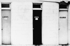
In places made of information, words are the interface, and categories are the infrastructure…
…and that’s why information architecture is no more ethically neutral than design of the first atom bomb.
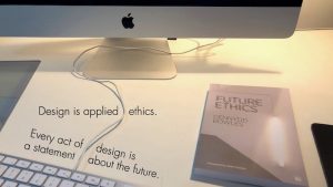
Cenndydd Bowles says “design is applied ethics” and “every act of design is a statement about the future.”
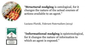
We should keep that in mind as we use structure and information as tools of persuasion. A structural nudge is a powerful way to shape behavior. An informational nudge sacrifices strength for freedom. As designers, we must choose wisely.
Now, all of this stuff is hard precisely because it’s soft. It’s about people, and so, to do any of it well, we must get better at research. That’s where this wonderful German word comes in. Merkwelt. We must get better at learning the unique “ways of viewing the world” of our users and stakeholders. The philosopher Thomas Nagel famously asked “What is it like to be a bat?” and while we may never know the answer, I do believe it’s the right question.
In 2015, I had an opportunity to do user research while working with the Baker Library at Harvard Business School. My client had just read Intertwingled, my book on systems thinking, and she was excited by my argument that “everything is connected from code to culture.” While it was clear the Library website needed to be fixed, she said “if we frame this project as a website redesign, we’ll have failed before we begin.” She understood that work and the Web have become so deeply intertwingled, it’s vital we move forward holistically.
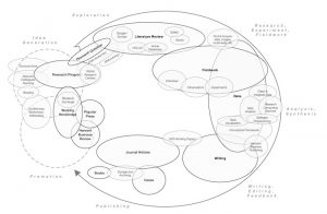
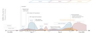
So we interviewed faculty, and we didn’t ask about their use of the website or the Library. We asked “how do you do research?” And then we made maps to illustrate the research lifecycle, so librarians and researchers could find better ways to collaborate.
We did the same with MBA students, in this case looking for teachable moments, when the students are motivated to seek and receive help.
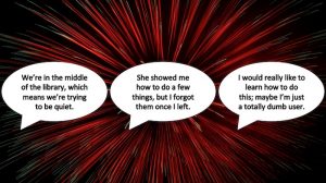
I’d like to tell the story of one of the MBA user research sessions. An MBA student is describing a reference interview and her subsequent inability to use the Library’s research databases. She says “we’re in the middle of the library, which means we’re trying to be quiet.” Baker has a beautiful reading room where folks go to study, and it’s very, very quiet. And that’s where reference interviews occur. It’s hard to pay attention when you feel self-conscious. She says “she showed me how to do a few things, but I forgot them once I left. I would really like to learn how to do this; maybe I’m just a totally dumb user.” It’s quite a feat to make a Harvard MBA student feel stupid.
So, she’s telling me her story, and I’m feeling sad because she’s feeling sad, but I’m also feeling happy, because my brain is exploding with ideas for improving the services and the physical and digital places in which those services are delivered. In short, this was a huge validation of our holistic, cross-channel approach to information architecture and user experience.
I’d like to conclude this section by noting that in the past 20 years, we’ve gone beyond the polar bear book in all sorts of ways. Thanks to Andrea Resmini, Dan Klyn, Abby Covert, Andrew Hinton, and many other friends within the community, we have reframed information architecture again and again. And I hope we never stop defining the damn thing (#dtdt), because change means the discipline is alive.
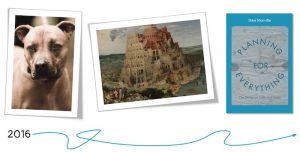
Okay, so let’s get back to my life story. Mostly, since library school, life as an information architect was good. And then in 2016 something happened that threw me for a loop. The election that November made me realize the extent to which many people have totally lost track of the truth. Immune to science and facts, they are easily misled, and often just believe what they want. Our society has fractured into a confusion of tongues, a Tower of Babel where there is no understanding.
Given my background in library and information science, this was especially disturbing. And it wasn’t just political. It was personal. I had a fight with a family member about racism and climate change that seriously damaged our relationship. And I began to question my career. At the time, I was consulting with a Fortune 500 user experience team that didn’t care about users or the truth. For months, I experienced disorientation, fear, anger. I did a lot of rage tweeting. I joined the resistance. And I read a lot of books.
Then I took two steps forward. First, I started walking dogs. I needed to do something good that had nothing to do with the Internet. So I volunteered at the Humane Society. And I love it. The dogs help me to heal. Second, I wrote a book about the design of paths and goals, because our society (and many of our organizations) are broken, and planning opens the door to change.
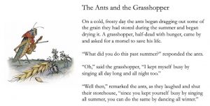
Most of us are familiar with Aesop’s fable about the hard-working ants and the starving grasshopper. It’s a tale we tell our kids. And the moral of the story is clear: plan or die. It’s a truth of nature we’ve assimilated into culture, and lived with for thousands of years.
In psychology, planning is seen as an executive function of the brain, and researchers use games like the Tower of Hanoi to study planning ability. Interestingly, those who plan ahead are best at simple versions of the game, but if you add a few rings, they struggle; it’s the folks who act and plan concurrently who succeed. The studies show we differ widely in how and how well we plan. But the good news is: since planning is a skill, all of us can get better.
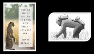
Despite the usual claims of human exceptionalism, we are not the only animals that plan. This bonobo, for instance, will carry handfuls of nuts as far as a mile to a flat rock where she knows she can crack them open to feed herself and her baby. In fact, all animals plan, and…
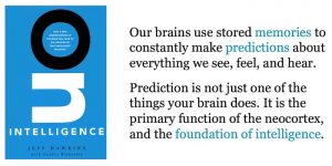
…we are planning all the time. In 2005, Jeff Hawkins explained how our brains use memories to make predictions, and argued that “prediction is not just one of the things your brain does. It is the primary function of the neocortex and the foundation of intelligence.”
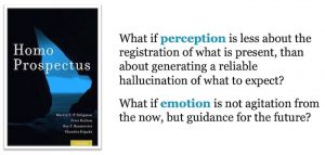
Similarly, in Homo Prospectus, Martin Seligman reveals the amazing extent to which our perceptions and emotions are shaped by expectations. He asks “what if emotion is not agitation from the now, but guidance for the future?” We feel a twinge of fear and change course to avoid a danger we predict (and we may never learn if the threat was real).
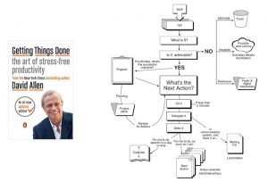
Now if you’re a practical person who wants to learn how to plan, you might read Getting Things Done. It’s a great book. I recommend it. But I do have concerns. It’s focused on productivity, prescribes a system that’s one-size-fits-all, and argues there’s one right way to plan.
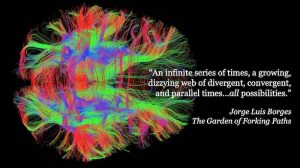
But planning is about so much more than productivity. It’s about finding meaning and purpose in our lives as we anticipate and explore “the garden of forking paths.”
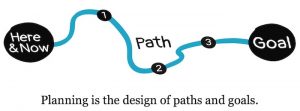
So I take an opposite approach. I define planning as the design of paths and goals. I believe the practices of design can be applied to planning far beyond our usual contexts.
In particular, designers can make planning visible, and illustrate there are many good ways to plan.
There’s also a huge opportunity for us to engage in strategic design. We need to get involved earlier in the process and help to define the what and why, not just the how.
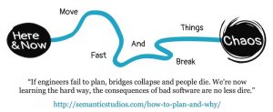
This is vital because the impact of what we do has never been greater. The software and systems we design affect every facet of life and work. To “move fast and break things” is dangerous. We must find a better balance between improvisation and planning.
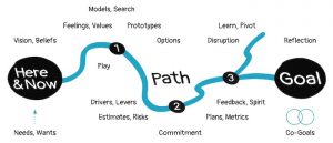
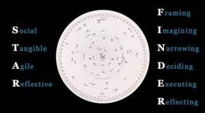
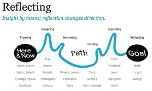
This is a map of the night sky that’s known as a STAR FINDER. It’s also a mnemonic I use in my book to introduce 4 principles and 6 practices that I’d love for you to remember. First, if we hope to get better at planning, we must make planning more social (involve people early and often), tangible (get ideas out of your head and into the world, so you can see and share what you think), agile (plan for change because disruption is inevitable), and reflective (question everything from the path and goals to your assumptions and beliefs). Those are the 4 principles. Second, we have the 6 practices: framing, imagining, narrowing, deciding, executing, reflecting. It may help to think of them as phases, but keep in mind that planning is nonlinear.
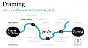
Framing involves how we understand and explain our plans. How do we translate our needs, wants, feelings, values, and beliefs into vision and goals?
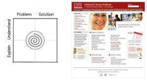
In 2004, I worked on a redesign of Cancer.gov, and it was framed as a traditional usability project. My clients wanted to reduce the number of clicks from the home page to destination content. I asked “but how do users get here in the first place?” and they said “don’t worry about that, we’re the National Cancer Institute. Everyone knows about us.” Of course, that wasn’t true, and it turned out their content wasn’t especially findable via Google, so I worked with my clients to reframe the project to include both usability and findability. And it was a success. The site went on to win awards and rise to the top of the American Customer Satisfaction Index for e-Government. This reframing occurred because, at the time, I was learning about search engine optimization. My awareness of a solution enabled me to see the problem. Framing is the most difficult and most important step, and there’s one thing that often stops us before we start.
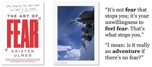
An idea appears in your mind for the first time, a twinge of fear warns of potential consequence, and the idea is gone before it ever had a chance. This happens more often than we know. In The Art of Fear, Kristen Ulmer, who used to be one of the world’s most extreme skiers, suggests the proper way to respond to fear is with curiosity and a sense of adventure; because life’s too short to play it safe, and repression doesn’t work.
Mindfulness is essential to the practice of framing. As Pema Chödrön says “the bodhisattva vow is to work on ourselves so that we can be effective instruments for social change; this is the basis for nonviolent protest and lasting social change.” In this sense, reflection is the way to right action, and meditation is the path to a goal.
Imagining expands awareness of paths and possibilities. We use models, prototypes, and search to create and explore options.
In a lovely book called The Psychology of Hope, Charles Snyder explains what it takes to be hopeful. He defines waypower as having the creativity and confidence to always find another way, and he argues that hope equals willpower plus waypower.
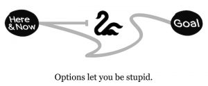
Fortunately, imagining helps us build both. As the architect Christopher Alexander has illustrated beautifully in his writing and work, stories and sketches and prototypes can inspire us by offering a glimpse of the dream. And they can also make us more aware of options…
…which is important because options let you be stupid, by enabling us to avoid those obstacles we failed to predict.
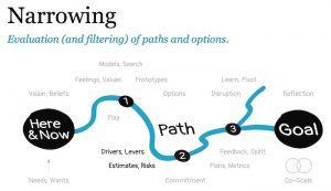
Narrowing involves the evaluation and filtering of paths and options using drivers, levers, estimates, and risks. Drivers help us eliminate paths. For instance, for a wedding the key drivers are the budget and the number of guests. When you define those variables, you narrow the options, and it’s easier to move ahead. Levers, on the other hand, fortify paths by revealing ways to amplify force. A lever helps answer the question: if I take this path, can I make it work?
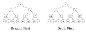
To evaluate options, novices search depth first, whereas experts do the opposite. Let me explain with a story. A few years ago, I was planning to take our family on a Caribbean vacation. I began reading about the islands, and the Turks & Caicos sounded incredible. If I’d gone depth first, I’d have spent time researching hotels, restaurants, and things to do. But I’m no novice when it comes to travel, so I switched gears and looked up flights, and they were crazy expensive. So we went to St. Thomas instead.
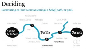
Deciding means committing to (and communicating) a belief, path, or goal, and defining how to measure success.
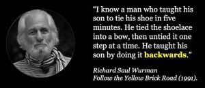
Mr. Wurman advises us to teach backwards by starting with the goal. I’ll go a step further and suggest that when struggling with a tough decision, write the instructions before you make the decision, as the act of explaining may change your choice.
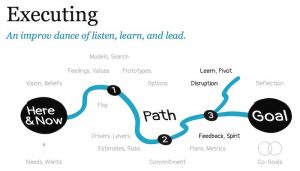
Getting things done isn’t just about grit or perseverance or what I prefer to call “spirit.” We must also listen to feedback, deal with disruption, and be prepared to learn and change. That’s why the biggest mistake in executing is to think that the planning is done.
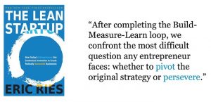
This is where we face that “most difficult question” of whether to pivot or persevere, which may return us to the practices of framing and imagining.
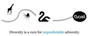
One way to improve the odds of a good decision is to involve different kinds of people, because different people find different ways around obstacles, or in other words, “diversity is a cure for unpredictable adversity.” And we shouldn’t aim only for demographic diversity but also for “diversity of thought.” We must include people who think and behave differently.
In reflecting, we look back and within, in search of insight that may change how we move forward.
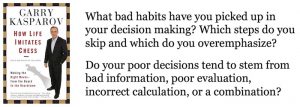
And, as Garry Kasparov notes, we’re not very good it. He loves to ask a question that most people struggle to answer: “when was the last time you made a bad decision?”
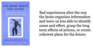
We don’t look back because it hurts to be wrong, and because change is hard, and, of course, nobody wants to re-live bad experiences. But, once again, repression doesn’t work. Recovery requires that we learn to tell the truth. And please don’t think I’m talking about someone else. We are all villains and victims of cultural trauma, and we’ve all been lying to ourselves.
Elephant society is matriarchal. The oldest female leads the way. In times of drought, she may be the only one who remembers the ancient paths to food and water. But these days, our roads and farms and fences block the way. To survive, elephants must abandon the wisdom, culture, and traditions that have kept them alive. In an era of rapid change and profound disruption, isn’t this our problem too?
I haven’t focused on the intellectual challenges of our work, because that’s not the root of the problem. The algorithms of Google and Facebook and Twitter aren’t hurting us by accident. They are the deliberate and inevitable result of perverse incentives. And so are the dark patterns for which many of us are responsible. The root of the problem is ethics. We must change the cultures of our organizations and our society. And we must start by telling the truth: there are no externalities. We need a new story that’s honest about the consequences of our actions on others, and we need a vision of a future that includes empathy and compassion for all sentient beings.
That’s what I mean by planning for everything.
And so we find ourselves back at Harpers Ferry, and I’d like to close by explaining why I talked about John Brown. You see, in my book on planning, I tell the stories of freedom fighters such as Joan of Arc, John Brown, Gandhi, Malala, and Nelson Mandela to illustrate their diversity of thought. John Brown, for instance, believed the ends justify the means, and so he started a war to end slavery. It’s worth noting that 150 years later, it’s not entirely clear if that war is over. Gandhi, in contrast, believed “there is the same connection between the means and the end as between the seed and the tree,” and so he pursued peace through nonviolent resistance.
Sadly, the question of how to deal with inequality, injustice, and misinformation is absolutely relevant to all of us today. Happily, we are all free to design our own paths and goals. We get to choose the heroes we celebrate and the stories we tell. So let’s soak up all the energy and inspiration here at STC 2019 in Denver, Colorado, and let’s go towards the fear, and let’s organize a better future, because we are all tomorrow’s architects. What we do next matters. And that’s all I have. Thank you for your attention.
by Peter Morville

