I’ve been practicing information architecture since 1994, and from Gopher to Google have seen dramatic changes in the landscape of organization, search and retrieval. Through these ten tempestuous years, I’ve found the infamous three circle diagram to be a great tool for explaining how and why we must strike a unique balance on each project between business goals and context, user needs and behavior, and content.
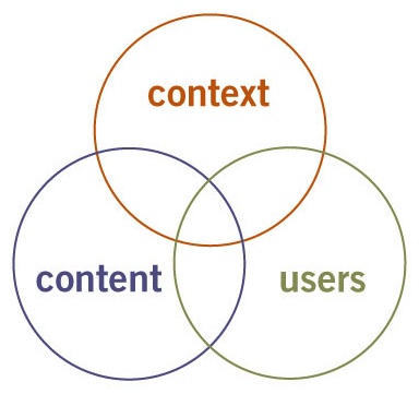
Three Circles of Information Architecture
While this diagram was conceived with IA in mind, it’s equally useful for explaining UX. In conjunction with Jesse’s masterpiece, I use the three circles to illustrate the distinction between user experience and user-centered design. I’m still not convinced UCD exists outside the realm of theory, but I practice user experience design every day.
Facets of the User Experience
When I broadened my interest from IA to UX, I found the need for a new diagram to illustrate the facets of user experience – especially to help clients understand why they must move beyond usability – and so with a little help from my friends developed the user experience honeycomb.
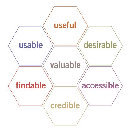
User Experience Honeycomb
Naturally, the jump from three circles to seven hexagons gave me a buzz, but after months of road testing, I can safely say this diagram has survived the honeymoon.
Here’s how I explain each facet or quality of the user experience:
- Useful. As practitioners, we can’t be content to paint within the lines drawn by managers. We must have the courage and creativity to ask whether our products and systems are useful, and to apply our knowledge of craft + medium to define innovative solutions that are more useful.
- Usable. Ease of use remains vital, and yet the interface-centered methods and perspectives of human-computer interaction do not address all dimensions of web design. In short, usability is necessary but not sufficient.
- Desirable. Our quest for efficiency must be tempered by an appreciation for the power and value of image, identity, brand, and other elements of emotional design.
- Findable. We must strive to design navigable web sites and locatable objects, so users can find what they need.
- Accessible. Just as our buildings have elevators and ramps, our web sites should be accessible to people with disabilities (more than 10% of the population). Today, it’s good business and the ethical thing to do. Eventually, it will become the law.
- Credible. Thanks to the Web Credibility Project, we’re beginning to understand the design elements that influence whether users trust and believe what we tell them.
- Valuable. Our sites must deliver value to our sponsors. For non-profits, the user experience must advance the mission. With for-profits, it must contribute to the bottom line and improve customer satisfaction.
The honeycomb hits the sweet spot by serving several purposes at once. First, it’s a great tool for advancing the conversation beyond usability and for helping people understand the need to define priorities. Is it more important for your web site to be desirable or accessible? How about usable or credible? The truth is, it depends on your unique balance of context, content and users, and the required tradeoffs are better made explicitly than unconsciously.
Second, this model supports a modular approach to web design. Let’s say you want to improve your site but lack the budget, time, or stomach for a complete overhaul. Why not try a targeted redesign, perhaps starting with Stanford’s ten guidelines as a resource for evaluating and enhancing the credibility of your web site?
Third, each facet of the user experience honeycomb can serve as a singular looking glass, transforming how we see what we do, and enabling us to explore beyond conventional boundaries.
A Different Way of Seeing
For example, I realized some time ago that while “information architect” describes my profession, findability defines my passion. Since then, I’ve found my focus on findability has opened my eyes, leading me beyond IA while simultaneously making me a better information architect.
Last Summer, while redesigning the Q web site, we identified findability as a top priority. Our quest to make this small site more findable took me beyond the discipline of information architecture and deep into the realm of search engine optimization.
That experience proved useful last Fall, during a redesign project for the National Cancer Institute, in which we used findability concepts and SEO statistics to alleviate an unhealthy fixation on the home page, raising awareness of the need to design findable documents for direct access via the Google, MSN, and Yahoo! search engines.
And this Spring, I was hired to perform my first findability audit for a major international nonprofit. Feeling a bit concerned about dedicating four weeks exclusively to findability, I asked whether I should also consider usability factors. “No thanks,” my client replied. “We already had Jakob in last year to focus on usability.”
A Big Hive
Though the findability audit was a success, it did feel ironic to once again be ensnared inside a box (or hexagon) of my own making. But I’m sticking with findability for now. Between my new seminar, my new book, and findability.org, I’m busy as a bee. And anytime I feel trapped, I can explore other facets of the user experience honeycomb, or perhaps even create a new diagram. For me, user experience design is a big hive: a dynamic, multi-dimensional space where there’s still plenty of room to build new boxes and draw new arrows, at least for the next ten years.
by Peter Morville