It’s an exhilarating time for the user experience community. Rising awareness of our value plus emerging technologies and transmedia trends have created conditions for a step change in our practice.
As an information architect, I’m enjoying the new challenges immensely, even as they sweep me outside my comfort zone. I’ve designed social software and rich user interfaces. I’ve sketched scenarios for the future of mobile search. I’ve mapped the user experience across channels and applications. And, I’ve increasingly found myself striving to clarify ideas for folks in the executive suite.
Consequently, I’m rethinking my role, redefining my deliverables, and embracing new forms of interdisciplinary collaboration. For instance, I’ve ensnared Jeffery Callender as co-author of Search Patterns, a new book (in process) about design for discovery and the future of search.
Together, we’re hoping to bring search to life with colorful, compelling stories, maps, and illustrations, which brings us back to deliverables.
Tools for Thinking
Two books have inspired me to think differently about discovery, communication, and design. First, Made to Stick challenged me to think simple. This book reveals the power of short phrases and surprising, personal stories to change minds and shape memories:
Proverbs are the Holy Grail of simplicity. Coming up with a short, compact phrase is easy. Anybody can do it. On the other hand, coming up with a profound compact phrase is incredibly difficult [yet] enduringly powerful.
We need to open gaps before we close them. Our tendency is to tell people the facts. First, though, they must realize that they need these facts.
This realization – that empathy emerges from the particular rather than the pattern – brings us back full circle to the Mother Teresa quote: “If I look at the mass, I will never act. If I look at the one, I will.”
The story’s power, then, is twofold: It provides simulation (knowledge about how to act) and inspiration (motivation to act).
Second, The Back of the Napkin encouraged me to think visual. This book shows how sketching can help us discover and sell ideas:
Visual thinking means taking advantage of our innate ability to see – both with our eyes and with our mind’s eye – in order to discover ideas that are otherwise invisible, develop those ideas quickly and intuitively, and then share those ideas with other people in a way that they simply “get.”
These two books are gems, and yet their simple ideas are surprisingly difficult to apply. Making things easy is hard. But, for our projects and our book, we’re convinced it’s worth the effort. So, building on Dan’s garage-sale principle: “everything looks different when we can see it all at once,” Jeff and I have begun collecting user experience deliverables, and laying them all out, so we can look, see, imagine, and show.
The Deliverables
This list describes twenty user experience deliverables with links to relevant resources and examples. Clearly, these artifacts of the process are not the whole story. We must also think about the relationship between goals, methods, and documents. And yet, for many of us, deliverables are the coin of the realm and merit special attention.
- Stories. A good story about a user’s experience can help people to see the problem (or opportunity), motivate people to take action, and stick in people’s memories long after we’re gone.

Storytelling in Business
The Secret Language of Leadership by Stephen Denning
Articles by Dave Snowden - Proverbs. High-concept pitches, generative analogies, and experience strategies invoke existing schemas to put the world in a wardrobe.

Experience Strategies by Jesse James Garrett
High Concept Pitches for Startups
English Proverbs (Wikiquote) - Personas. Portraits and profiles of user types (and their goals and behaviors) remind us all that “you are not the user” and serve as an invaluable compass for design and development.

Personas (Dey Alexander)
Personas are NOT a Document by Jared Spool
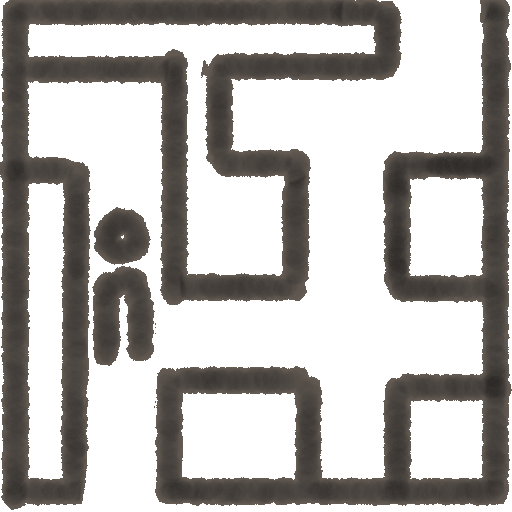
Personas (Wikipedia) - Scenarios. Positioning personas in natural contexts gets us thinking about how a system fits the lives of real people.
What is a Scenario?
Scenarios by Shawn Henry
Use Cases and User Scenarios (IxDA) - Content Inventories. Reviewing and describing documents and objects is a prerequisite to effective structure and organization. The artifact (often a spreadsheet) is a sign of due diligence.

Doing a Content Inventory by Jeff Veen
Why You Shouldn’t by Leisa Reichelt
The Rolling Content Inventory by Lou Rosenfeld - Analytics. We learn by wallowing in interaction, search, and navigation data. And, we teach by uncovering and charting the most pivotal landmarks, portals, paths, and patterns.

Web Analytics (Wikipedia)
Web Analytics and IA by Hallie Wilfert
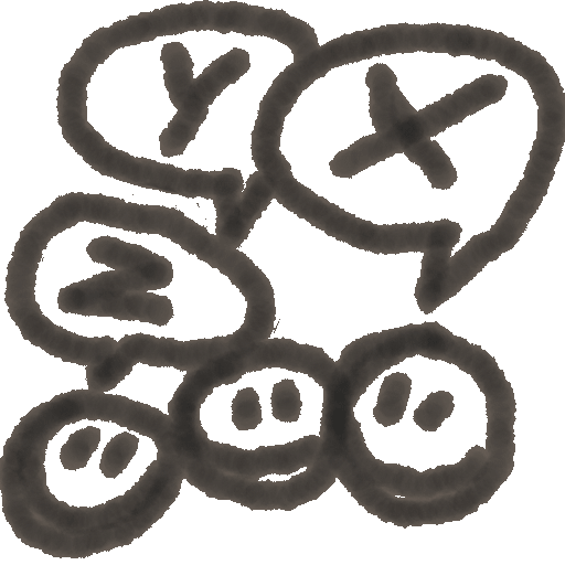
Search Log Analysis (Dey Alexander) - User Surveys. Asking the same questions of many users across multiple audiences can reveal existing gaps and common needs, and show how they map to customer satisfaction.
When to Use Which by Christian Rohrer
American Customer Satisfaction Index
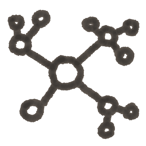
Pew Internet & American Life - Concept Maps. In the territory of concepts, a good map can help us see where we are and decide what to do by establishing landmarks, clarifying relationships, and identifying true north.
Back of the Napkin by Dan Roam
What is Your Mental Model? (Indi Young)
Flickr User Model by Bryce Glass - System Maps. A visual representation of objects and relationships within a system can aid understanding and finding for both stakeholders and users. Shift gears from “as-is” to “to-be” and you have a blueprint for structural redesign.

Map – Territory Relationship (Wikipedia)
London Underground Maps (Ask Edward Tufte)
Developing Taxonomy by Christian Ricci - Process Flows. How do users move through a system? How can we improve these flows? A symbolic depiction can enlighten desire lines and show the benefits of (less) chosen paths.
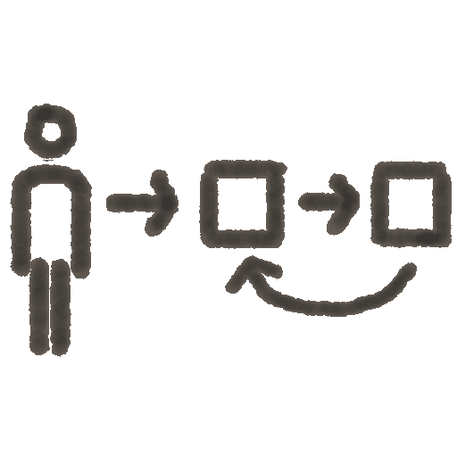
User Flows (Google Images)
Improving User Task Flows by Austin Govella
Desire Path (Wikipedia) - Wireframes. Sketches of pages and screens can focus us on structure, organization, navigation, and interaction before investing time and attention in color, typography, and image.

Where the Wireframes Are by Dan Brown
Real Wireframes by Stephen Turbek
Wireflow Trading Card (nForm) - Storyboards. A series of sketches with narrative displayed in sequence can tell a story and paint a picture by showing interaction between users and systems in context over time.
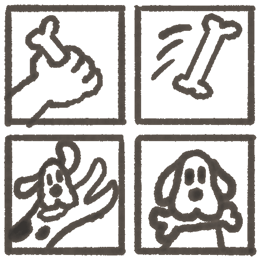
Comics by Rebekah Sedaca
Understanding Comics by Scott McCloud (Video)
Swimlane Diagram (nForm) - Concept Designs. Interface designs and composite art invoke an emotional response and capture people’s attention by presenting a high-fidelity image of how the product could look.

Concept Designs (Flickr)
Concept Design Tools by Victor Lombardi
Found Futures (Stuart Candy) - Prototypes. From paper prototypes to pre-alpha software and hardware, working models drive rapid iteration and emotional engagement by showing how a product will look and feel.

Paper Prototyping by Shawn Medero
Prototyping with XHTML by Anders Ramsay and Leah Buley
WineM (Technology Sketch) - Narrative Reports. Writing is a great tool for thinking and organizing. And, it’s hard to beat a written report for presenting detailed results and analysis or formal recommendations. Reports can serve as a container for most other deliverables.

Style by Joseph M. Williams
Strategy Report by Morville & Rosenfeld
Business Brief (Adaptive Path) - Presentations. As the lingua franca of business, slideshows (and videos) can be great for telling a story or painting a picture. They can also be dead boring, unless you present in person, hit the highlights, and beware the bullets. Presentations can serve as a container for most other deliverables.

The Cognitive Style of PowerPoint by Edward Tufte
In Defense of PowerPoint by Don Norman
IA Summit Presentations (SlideShare) - Plans. Project plans, roadmaps, and schedules guide design and development activity by clarifying roles and responsibilities.

Gantt Charts
Project Management (Wikipedia)
The Deadline by Tom DeMarco - Specifications. An explicit set of requirements describing the behavior or function of a system is often a necessary element in the transition from design to development.

Usable Software Specifications by Brian Krause
Painless Functional Specifications by Joel Spolsky
Just a Fairy Tale? by Dan Willis - Style Guides. A manual that defines a set of standards for identity, design, and writing can promote clarity and consistency.
Guidance on Style Guides by Chauncey Wilson
Web Style Guide (University of Pennsylvania)
Web Style Guide by Patrick Lynch and Sarah Horton - Design Patterns. A pattern library that shows repeatable solutions to common problems can describe best practices, encourage sharing and reuse, and promote consistency.

About Patterns by Jenifer Tidwell
Yahoo! Design Pattern Library
Implementing a Pattern Library
Organizing the Deliverables
Of course, compiling a list is only the first step. For each project, we must strive for the optimal mix. Since our deliverables resist a taxonomy, asking questions may help derive their folksonomy.
- Audience. Who must you reach?
- Content. What is the message?
- Context. Where is the conversation?
- Process. When is the message?
- Problem. Why are you communicating?
And, the questions never end. Should your argument be simple or elaborate? Quantitative or qualitative? We can organize and describe these deliverables until the end of time. We’ve made a start. Perhaps you can help. Will you tag a few in our collection on Flickr?
Treasure Map
If you’ve made it this far, you deserve a reward. That’s a lot of words about a lot of deliverables. And, that’s the problem. It’s hard to find the best trees when we can’t see the forest. So, we often fall back on old habits. We churn out wireframes when a story may be worth its weight in gold. Some great deliverables stay hidden in plain sight. That’s why we created this treasure map for our wall (and yours).
Good luck exploring! And, please let us know what you discover!
by Peter Morville
